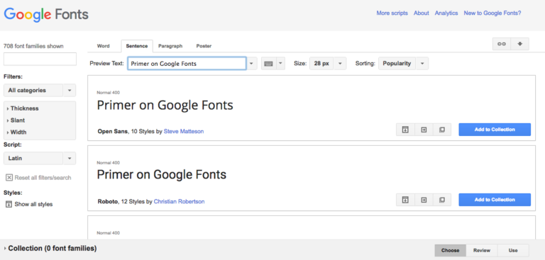

If you’re looking for a simple, integrated way to change the look of your written work online, Google Fonts may be exactly what you’re looking for! With Google Fonts’ speedy implementation and their hundreds of options, you now have the ability to carefully craft your message, making it exactly what you need to reach your audience.
Google Fonts-Transforming Typeface
Google Fonts’ wide variety of typefaces exist to give you plug-in options for WordPress, Squarespace, Xine and other third-party blogs that, before 1998, weren’t possible to use online. “Web safe” fonts – Arial, Georgia, Verdana and others – were the only ones that could be used before then. Even now that Cascading Style Sheets (CSS) have opened web pages to far more creative options, the cost can still seem steep. Font-rental services such as Webtype can cost you up to $40 per year for a single choice. Google Fonts brings you a group of more than 700 available fonts, free of charge, that you’re able to download at will. Smashing Magazine, in a review of the various services in which you could find fonts for your website, said of Google Fonts, “it has the potential to have a significant impact on the future of Web fonts,” while also calling it the easiest starting point for font finders.
Bring Life to Your Message
Finding the font that precisely suits your message has been made easier by the Google Fonts service as well. You’re able to browse straight through the list at a casual pace, or enter search terms to find the specific wording curvature that gives your message life.
For example, a Gothic font could add an edge of dripping fear to your blog about horror movies, while Century could give your writing an air of precision and improved spacing for recipes or other word-centric posts. Find what you’re planning to convey through your website, then you can find a font that properly amplifies your voice to the reader.
And yes, it is possible to have a font that amplifies your voice too much or into an unintended direction. For instance, imagine a scenario where you’re starting a website to blog about your political views regarding the upcoming elections. You come to choosing which font you want and decide that the font for you is one that gives the letters a strong, bold look to grab reader attention. At this stage, you have to consider what would be best for your readers as well: Choosing the largest, boldest typeface there is from Google Fonts (such as one called Move Artu Super Heavy Bold) may hurt your readers’ eyes or simply turn them away as your message becomes overwhelmed by the heavily stylized font choice. A more suitable font, Caslon Bold for instance, can still attract the same amount of attention but isn’t overwhelming your message and tone.
Selecting the Right Fonts
Using the Google Fonts page can seem overwhelming at first, but it’s as simple as shopping at any online retailer. After selecting the font(s) you’re looking for:
- Click “Add to Collection.” Here you can store and compare every font you’re considering at once.
- Or click the “Quick-use.” This icon appears in the middle of the three icons on the bottom-right of the font tab.
- Next, you’ll then be taken to a page to select the shading and thickness of your font, and be notified of how much strain your particular font choice will put on your webpage’s loading time. This makes selecting only a few necessary fonts seem all that much more important to deliver a clean Web-browsing experience.
- Finally, you’ll then click on which subset – smaller style choices integrated into your chosen font – you want and be ready to install!
Of course, finding more than one font that carries your message can seem even more difficult, but is made simple by Google Fonts. If you find yourself wanting more than one font, it’s best to choose the possibilities and use the “Add to Collection” option to store them in place before adding them to your site’s code. Even if you have your heart set on one font but aren’t quite sure which other font goes with it, Google Fonts has an option for you. Just to the right of the “Quick-use” icon is one that reads “Pop out,” allowing you to view how every available character in the set looks, check out statistics collected from countries around the world based on that font’s usage, and provides a tab called “Pairings.” Under the “Pairings” tab, Google Fonts will give you examples of other appropriate typefaces that people have downloaded with your choice. This is meant to be used as a stage for recommendations, all of which are easily located back on the main page.
Install and Get Started!
Implementation of your chosen font into your webpage is usually no more than just a few steps. After choosing your fonts, their substyle, and shading options:
- Scroll down the page to find a code inside a box with a different available tabs
- For WordPress and Squarespace blog structures, it’s as simple as downloading a plug-in that automatically recognizes the entire Google Fonts library and initializes them at will.
- In the other cases, it’s as simple as taking that aforementioned code, going into the HTML code editing mode of your website, locating the “<head>” command near the top, and pasting the code just after that. This will tell your webpage to load your chosen font types every time the homepage is opened.
Now it’s up to you to make some good use out of your new fonts, and maybe even create more possibilities with the support of Google Fonts! To learn more about the fonts or browse their selection, go to www.google.com/fonts.

